Best Practice: Creating Tension with Colored Lighting Contrast

Thesis Summary
The level made in Dying Light focuses on lighting contrast, color, and best practices to impact the player’s feeling of tension. Contrast and related experiments that predict the player's reaction when interacting with the artifact. The level contains 10 rooms, which include different colored lighting contrasts groups to make a dynamic of the player’s tense feelings and handle the whole gameplay process works as the designer’s plan.
-
Tools: Dying Light Developer Tools
-
Game: Dying Light

Gameplay
INTRODUCTION
This study investigates the correlation between colored lighting contrast and player tension in First Person Shooter (FPS) game level design. The project is divided into two stages: The initial stage involves designing two colored lighting contrast experiments using Unreal Engine, while the subsequent stage entails creating a game level that incorporates findings from the first stage. Players traverse a military lab, navigate an underground pipe area, and confront the final boss in a church. The intended gameplay pacing is regulated by employing a combination of colored lighting to modulate player tension. This dynamic tension contributes to an enriched gaming experience.
Unreal Engine Experiments
An effective way to conduct research on colored lighting in game design is to analyze horror games and films. By playing popular horror games such as Dead Space, the Silent Hill Series, Fatal Frame Series, The Medium, Blair Witch, and Resident Evil 7 & 8, Resident Evil Remake 2 & 4, several lighting techniques emerged as common methods for creating tension: low-key scenes, high contrast between light and dark, and the prevalent use of blue and red hues to signal danger and threat.
Based on these findings, additional colors closely related to the seven primary colors were selected for testing (dominant colors in bold):
• Red
• Orange
• Yellow
• Magenta
• Cyan
• Purple
• Violet
• Chartreuse
• Green
• Spring Green
• Blue
• Dodger Blue
Test 1: Two Colored Lighting Contrast
The selected colored lighting was divided into groups, with each group consisting of two different colors occupying one room in the level. All lights had the same low-intensity parameter of 8 cd (candela) since high intensity tends to diminish tension across all colors. Testers entered each room, stayed for approximately 5 seconds, rated their tension on a scale of 1 to 5, and then proceeded to the next room. White lighting was used in the corridors to allow testers to navigate between rooms without affecting the experiment.
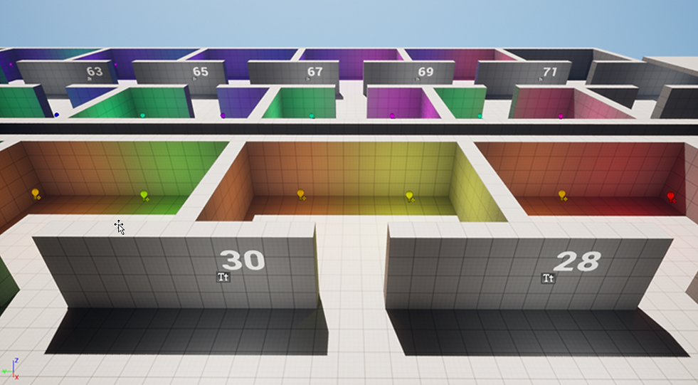
Testing Level Overview

Testing Process
The following two images illustrate the varying tension-creation abilities of different color combinations, with higher scores indicating greater effectiveness in evoking tension.

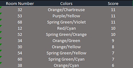
High Score
Low Score
Test 2: Single Colored Lighting Contrast
After conducting two colored lighting contrast tests, an additional experiment was designed to assess the impact of single-colored lighting with varying saturation levels. A long corridor was created, featuring single-colored lighting with intensities ranging from high to low. Based on the first experiment’s results, six representative colors were selected: Orange, Red, Dodger Blue, Green, Blue, and White. These colors covered various potential levels for creating tension. Testers moved slowly through the corridor, pausing for approximately 5 seconds at each numbered section, and recorded at which point they began to experience tension.

Testing Level Overview

Testing Process
The image below displays the tension-creation capabilities of each color. A lower score in the column indicates that the color can more easily create tension, even in brighter lighting conditions.

Color & Score
Tension Curve
Armed with the insights gathered from the previous experiments, a series of colors were selected and arranged in a sequence designed to follow the tension curve outlined below:

Predicted Tension Curve
Level Layout
The level is divided into 10 sections, utilizing the same colors to ensure a smooth and natural transition. A combination of white and dark is employed to relieve tension.
Area 1
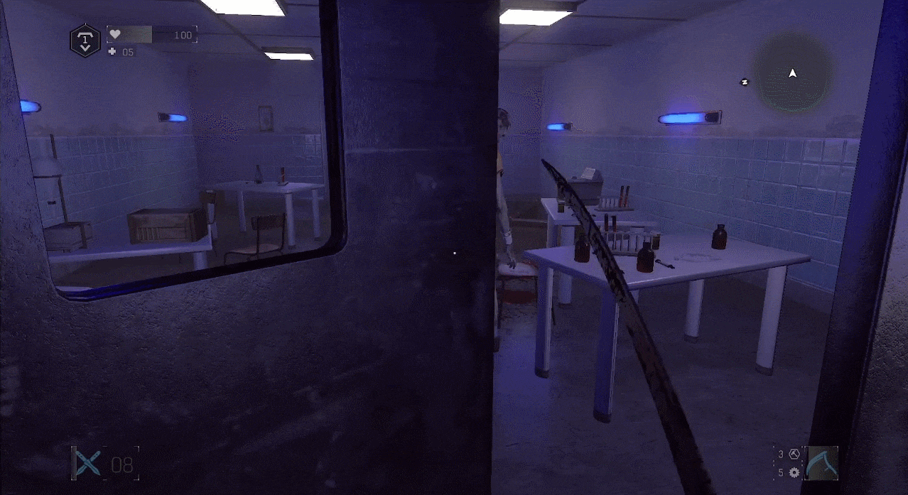
The player begins in a hospital cell. Natural lighting, primarily white, is used to convey a sense of familiarity and comfort to the player at the outset.
Area Gameplay
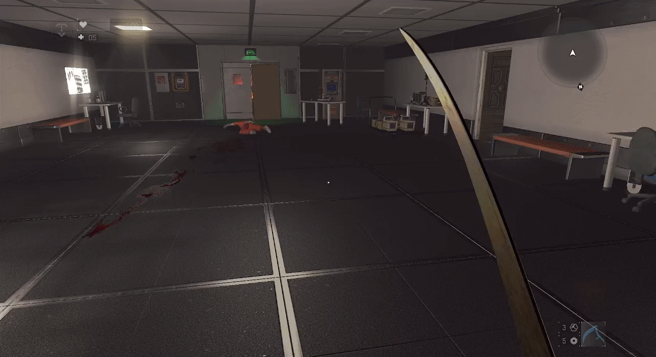
Area 2
A flare beneath the operating table captures the player's attention. A combination of orange and green lighting creates a peculiar atmosphere in this room.
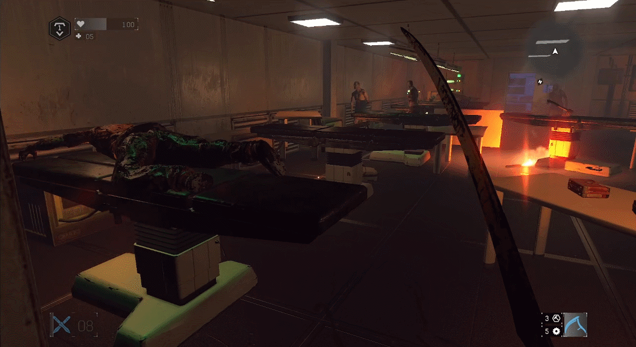
Area Gameplay
Area 3
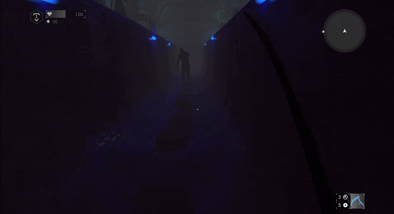
The lighting undergoes a significant shift from low to high color temperature. The presence of blue and purple lights in the room and corridor intensifies the tension, evoking a sense of suspicion and coldness for the player.
Area Gameplay
Area 4
The lighting undergoes a significant shift from low to high color temperature. The presence of blue and purple lights in the room and corridor intensifies the tension, evoking a sense of suspicion and coldness for the player.

Area Gameplay
Area 5
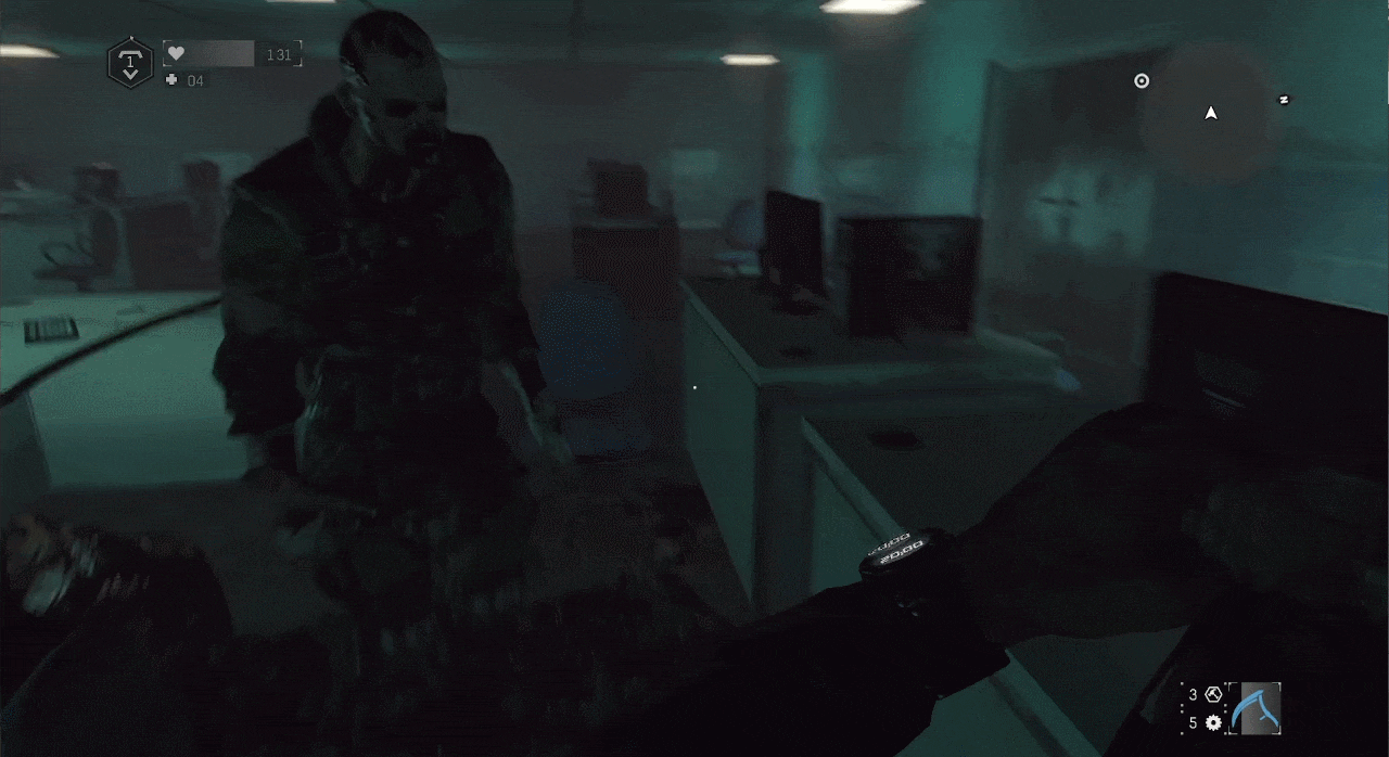
Spring green and cyan lighting are utilized in the office area to evoke feelings of sickness and discomfort. Ceiling and desk lamps serve as the primary lighting sources.
Area Gameplay
Area 6
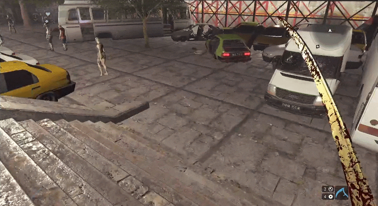
Natural lighting returns in an open space, where the expansive view and familiar lighting help to release accumulated tension.
Area Gameplay
Area 7
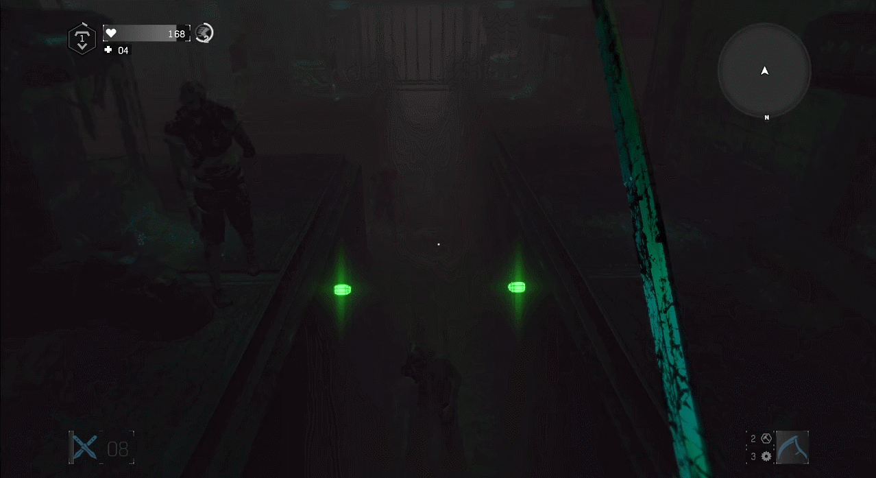
Green lighting in the underground tunnel evokes associations with mildew and polluted, foul-smelling water, fitting for the dirty environment.
Area Gameplay
Area 8
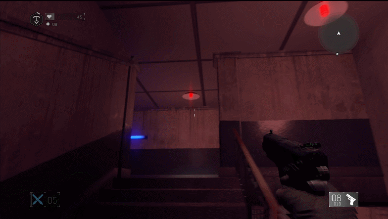
At the bottom of the tunnel, blue lights make the surroundings appear darker than the area above the trench, causing build-up tension.
Area Gameplay
Area 9
The tunnel's end is marked by highly saturated red lighting. The combination of blue and red creates a contrasting effect based on the typical perception of these colors. As the player returns to a narrower open space, the main colors remain blue and red, but with lower saturation.
Area Gameplay
Area 10
Upon entering the church area, the dominant red color signals danger and threat. Inside the church, highly saturated red lighting fills the space and a Demolisher charges toward the player. Tension reaches its climax and is ultimately released after the boss's defeat.

Area Gameplay
RESULT
Color and Tension Curve
The image below presents two tension curves: one representing the average score of all 11 playtesters' responses, and the other showing my predicted score. Apart from the similarities, the most notable difference is that green generates more tension than I initially anticipated.

Tension Curve & Colors (Predicted & Testers' Feedback)
Best Practices
-
Design the experiment focused on isolating the color and figuring out their abilities of tension creation, better to test single color and dual colors.
-
Construct the tension curve for the level.
-
Based on the tension curve and data collected from the experiment, choose appropriate color combinations to meet the dynamic tension requirements of the curve.
-
Build the level and adjust colored lights to ensure they fit the aesthetic theme and are not too saturated.
Conclusion
Designing a tension curve at the level design stage involves studying factors that influence player tension, such as colored lights and lighting contrast. Playtesting, with playtesters rating the tension in each area, offers insights into whether the intended tension design is being achieved. It's important to acknowledge that not all players interpret the intent as anticipated, leading to variations in comparison graphs. However, the overall results tend to align with expectations. This thesis aims to offer valuable insights for level designers, assisting them in controlling tension with colored lighting to enhance player immersion and overall game experience. By combining various colored lighting contrast factors, level designers can pursue the desired stressful emotional response or tension level.